|
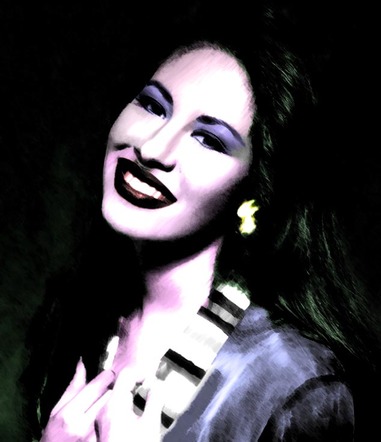
The Tejano Queen
Medium: Photoshop/Photo Manipulation Size: 35.56 x 41.91 cm October 2016 Exhibition Text: For this project, I used Photoshop to manipulate the image in the way I wanted it, but also with some inspiration from the work of Andy Warhol. I wanted to show that even after death, Selena Quintanilla lives on. |
Artistic Inspiration:
For my artistic inspiration, I was inspired by the works of Andy Warhol, specifically the pieces, Liz #6 and Jackie Triptych. Warhol uses a technique called "silkscreen". For this technique, Warhol printed photos that were found in magazines or newspapers directly onto a canvas, where he would then add his own touch to the image. Warhol had been interested in movie stars since he was young, and most of his famous works focused on the media's image, not the real person, which is why he used images from magazines/newspapers (seen below). I wanted to do my own version when it came to my image, and so I decided to use Photoshop instead of using acrylic paint. The main reason why I chose these pieces by Andy Warhol, was because the celebrities shown in these pieces seem to express some kind of emotion, or have a story behind them. For example, in Liz #6, actress Elizabeth Taylor was very sick at the time, and looked tired and was losing weight, but viewers can't tell by the image for it shows another side. In my piece, I wanted to show that emotion or different story by the colors and image I used.
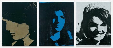
Andy Warhol, Jackie Triptych, c. 1964. Acrylic paint, spray paint, and silkscreen ink on linen. 50.8 cm x 40.64 cm.
"Andy Warhol, Jackie Triptych, 1964." SFMOMA. N.p., n.d. Web. 28 Sept. 2016. From https://www.sfmoma.org/artwork/FC.400.A-C |
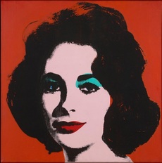
Andy Warhol, Liz #6 [Early Colored Liz], c.1963. Acrylic paint and silkscreen ink on linen. 101.6 cm x 101.6 cm.
"Andy Warhol, Liz #6 [Early Colored Liz], 1963." SFMOMA. N.p., n.d. Web. 28 Sept. 2016. From https://www.sfmoma.org/artwork/98.563 |
Cultural Inspiration:
As in my previous work, I was inspired by Mexican culture, but also the sub-culture of Tejano. A Tejano refers to a person of Hispanic descent, born and living in the U.S. state of Texas. For my piece, I used famous Mexican-American (also Tejano) singer, Selena Quintanilla, who was shot dead by her friend and boutique manager, Yolanda Saldívar in 1995. Selena tried to be a role model for younger girls, and many did look up to her. Selena incorporated a variety of genres of music into her Tejano music, such as R&B, disco, Latin pop, techno-pop, western, and more. I was interested her life, for her father put her in a band with her siblings when she was a kid (Selena y Los Dinos), she became famous at a young age, married one of the new members of her band at age 21, owned multiple boutiques, and was unfortunately killed at the age of 23. The culture of what she stood for inspired me, and eventually I decided to use Selena as the main focus of my image.
Experimentation:
|
Before creating my piece, I decided to do a little experimentation with another photo. I found an image of mine that practically was a whole body shot, which was good since my subject was a person, not an object. I proceeded to play around with some of the Photoshop tools, seeing which ones gave me the effect I wanted. I found a filter that was pretty close to what I wanted, and then adjusted it. Next, I adjusted the hue and brightness of the image, making it darker and adding more green to it. FInally, I cropped about half the image and saved it.
|
|
Process:
|
1.) The first thing I did was crop the image, and then I changed the photo from color to black & white.
2.) I then went to the filter gallery and went selected the Brush Stroke tab, and chose dark strokes. 3.) I then adjusted the balance to around 7 or 8, the black intensity to 8, and the white intensity to 2. I wanted to create a contrast between the lighting and shadow in the image. 4.) Next, I changed the hue by going to the Adjustments tab. I adjusted the cyan color tab, and the magenta color tab. 5.) After that, I clicked the Quick Selection Tool, and selected the area around the eye. 6.) On that selected area, I went to the Adjustments tab again, and clicked on the Photo filter tab. I went to color and chose purple at first, but later changed it to blue (this area then turned blue). 7.) I then selected the next eye and did the same step there. 8.) I eventually repeated step 7, but on different areas of her face, such as her lips (changed to dark red), and her skin (purplish-pink). I the changed her earring (yellow), her jacket (blue), and her hair and background (green). 9.) Lastly, I fixed the lighting and the contrast/sharpness of the image to the way I wanted it. |
|
Sketches:
|
|
For my sketches, I decided to focus on her eyes and hair, for I already knew what colors I wanted for her skin and lips. I did a purple hue for the first eye, for I felt it would complement the pink skin tone I wanted to use. My next sketch is of some of her hair. I did one with green and the other in blue. In the end I chose the green because I felt that the blue wouldn't be so noticable in the dark background. I then did a different eye, but this time with a redish-pinkish hue. I didn't use this hue because I felt that it wouldn't show so well with the pink skin tone, and that it'll look a bit weird or too plain around the eyes. My last sketch was of another eye. For this eye, I was considering of keeping the surrounding area a gray or something similar to that, and add neon orange around the area as well but only in streaks or keep it transparent over the gray.
|
Meaning Behind My Piece:
The image and colors I chose for my piece fit with the meaning, for my meaning is that while Selena may no longer be alive (the dark colors and background), she still lives on (Selena's smile in the image). in the hearts of many who loved her. The reason why I chose to use Selena as my main inspiration, was because she was someone who was considered to be a role model to young Latina girls, and I continue to listen to her songs, even though I was never alive while she made music. My parents always watched the televised event of her last concert when it aired around the anniversary of her death, and I would watch along. I would remember her wearing one of her most iconic outfits, a sort of one piece, purple jumper and removable jacket. She also wore her signature red lipstick. In my image, I wanted her to keep her signature lipstick color, and while it may be hard to see, it's still in there. While I was never alive to see her rising success while she was still performing, she will always be a big part of my childhood.
Reflection:
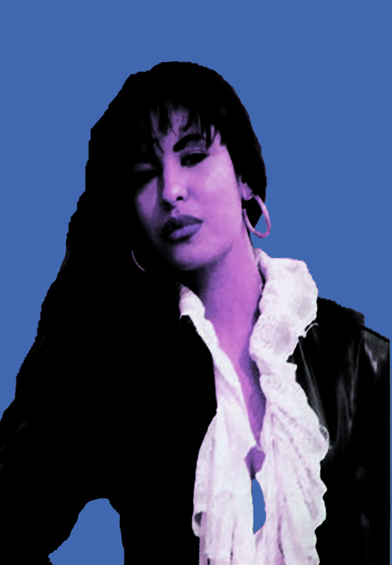
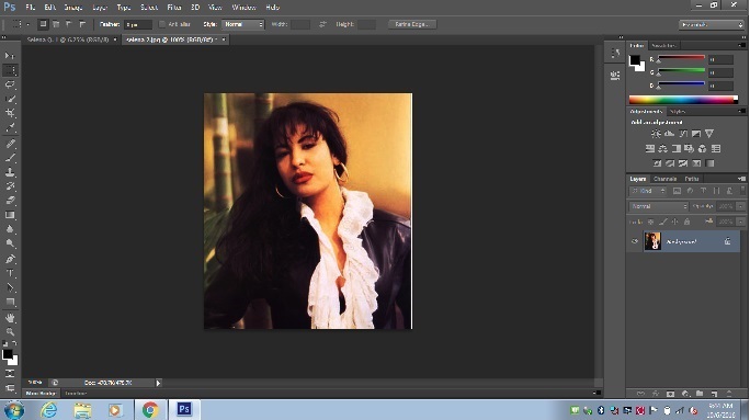
During this project, I had my ups and downs. When I first decided to use Photoshop for the project, I had no idea where to start. I decided to play around with some of the tools, and some interested me. I then used one of my own images to do my experimentation on, and I loved the way it turned out. I then had to find an image that wasn't a full body image, but a head shot of Selena. This proved to be more difficult than I thought, and the images that were head shots, were too blurry to use. An example of this is down below. For some reason I had trouble recreating the experimentation I did before, and it came out looking terrible. The image was too blurry, the crop wasn't right, I hated the color choice, and it clearly looked like bad Photoshop. I tried again, however I didn't like the way that image looked either.
|
These were the images I wanted to use, but it looked so bad, that I decided to change the image.
|
I ended up having to start all over, for the work that I did do looked horrible. Before I began a whole new piece, I played around with the Photoshop tools some more. After doing this, I chose another photo and began to work and didn't stop, for I was afraid that I would possibly forget what I had done while I was playing around with the tools before. I was happy with the way my final piece came out, and I thought it looked a lot better than what I had previously done. Contrasting my final piece with my failed piece, noticeable differences could be seen. I felt like the meaning was portrayed well with what I completed. I thought that the final image is what I wanted to demonstrate for my meaning, for the colors I wanted were mostly there, the happy smile on Selena's face contrasting against the dark background, and the warm colors fading into the cool colors.
|
Connecting to the ACT:
1.) In Andy Warhol's works, his pieces used warm and cool colors together, and I wanted to do the same. While Warhol's pieces used a screen printing technique, I did my piece differenly by using photo manipulation/Photoshop.
2.) The overall approach Warhol is trying to make or show is that he likes to use the media's interpretation of a person. Warhol's work only emphasizes that image even more, for his work is widely known by many.
3.) Some conclusions I've discovered about the media's culture, is that it likes to show different sides to a person, and that it doesn't matter what side that may be. The media doesn't care about just making someone look good, but also making them look bad, and it tends to do this by creating or spreading rumors about that person, or showing an photograph that could potentially ruin that person's image.
4.) The central idea around my research was that media only shows one side of a person. The pieces (above) created by Warhol only show the glamorous side of celebrities that the media had taken photos of, and that the true personalities of these celebrities can't be seen in these images.
5.) Some inferences I made while reading my research is that Andy Warhol loved the media's perspective on the rich and famous. Andy Warhol has discussed that most of the images he uses for his pieces are from magazines, movies, newspapers, etc., and of course these images are from different types of media. He never uses personal images from the that person, and is more interested in what the media portrays the celebrity.
